top of page
Digi Beauty
A look into the creative development, packaging design, & brand evolution of Digi - from its early concept and initial launch at Ulta, to its rebrand as Digi by Glamnetic. This project showcases my end-to-end involvement in building a brand, including logo design, visual identity, packaging systems, assortment strategy, & product development.
Date
2024-2026
Project Type
Brand Development | Package Design
Role
Creative Direction, Brand Identity, Packaging, Product Design, Production Artwork

The First Chapter
A fresh take for a new audience.
Digi was created to fill a white space in the press-on nail category - a younger, more accessible brand with trend-forward energy. The goal was to leverage Glamnetic's category leadership while meeting a mass market customer & capturing the growing demand for DIY beauty, self-expression, & impulse purchases.


Early Concepts
Exploring a standalone identity.
In the initial concept phase, Digi existed as an independent brand with a playful, expressive aesthetic. I developed the early logo explorations, color palettes, typography, & packaging directions to establish a unique identity that felt youthful, fun, & distinctly different from Glamnetic.
Fun fact, Digi's first name was Origin8! (like originate, original)


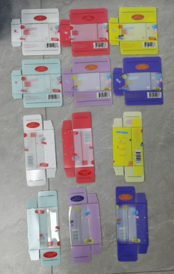
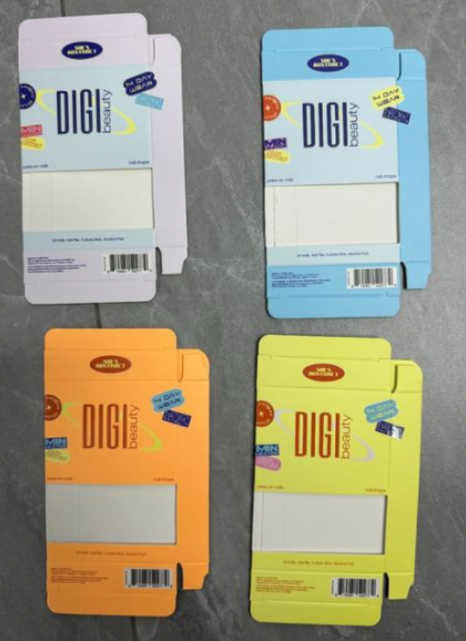


At the very start, Digi was very Y2K themed. She was bright, and different from anything else on the market at the time. We tested many logos, and so many color palettes, window layouts, packaging shapes.
The First Launch
Where we landed.
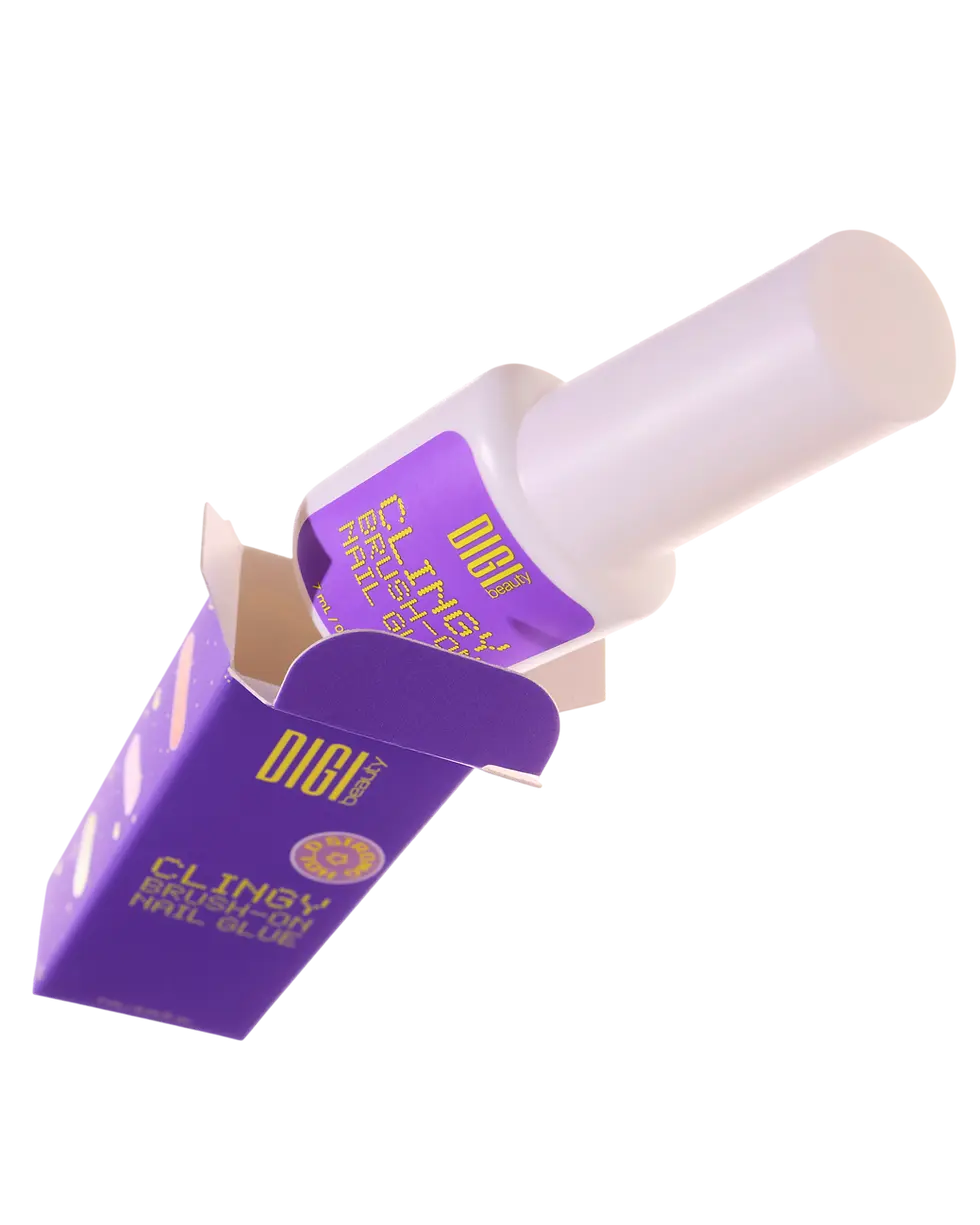
After exploring a wide range of concepts, Digi launched with a bold purple-and-yellow identity that felt youthful, trend-forward, & distinctive.
The chosen direction balanced strong shelf appeal, clear & memorable branding, & a fun, editorial personality - making it merchandisable, recognizably Digi, & scalable across a growing product assortment.


Pantone 2103 C
Pantone 910 C
The Rebrand
Meet Digi By Glamnetic.

New Name Lockup
Instantly connects the brands. Adds trust, equity, & commercial scale.
We evolved the brand with a clearer vision, connecting it to Glamnetic as a line in the same family. The rebrand introduces a more refined identity, elevated assortment strategy, & a more inclusive positioning - maintaining a youthful, expressive feel while bringing strength & cohesion. At a glance, it is unmistakably part of the Glamnetic family.
Smarter Assortment
-
70% Core neutrals, shades, & modern French styles.
-
30% trend SKUs with bold, seasonal art & collabs.
-
More inclusive sizing, shapes, & lengths based on consumer feedback.
Refined Visual Identity
-
Rectangular packaging (i.e. Glamnetic is more square)
-
Soft pinks, silver details as a nod to Glamnetic's branding
-
A more timeless look
More Inclusive Positioning
-
No longer "Glamnetic's little sister", instead an extension of Glamnetic
-
Represents a new wave: youthful nails for every expression - same quality, new attitude
Final Packaging System
A cohesive, modern look for retail.
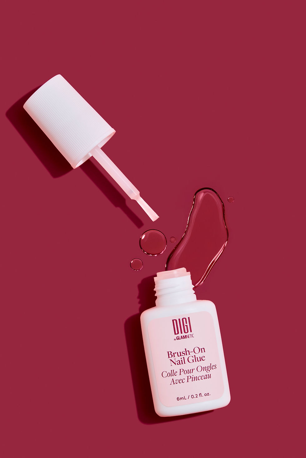
The updated packaging reflects the brand's evolution - a cohesive system designed for shelf impact, discovery, & everyday self-expression. With a clean, modern structure, soft pinks, signature Glamnetic elements, & a broad range of shades & finishes, the system feels premium yet playful, & true to the Digi personality.

bottom of page